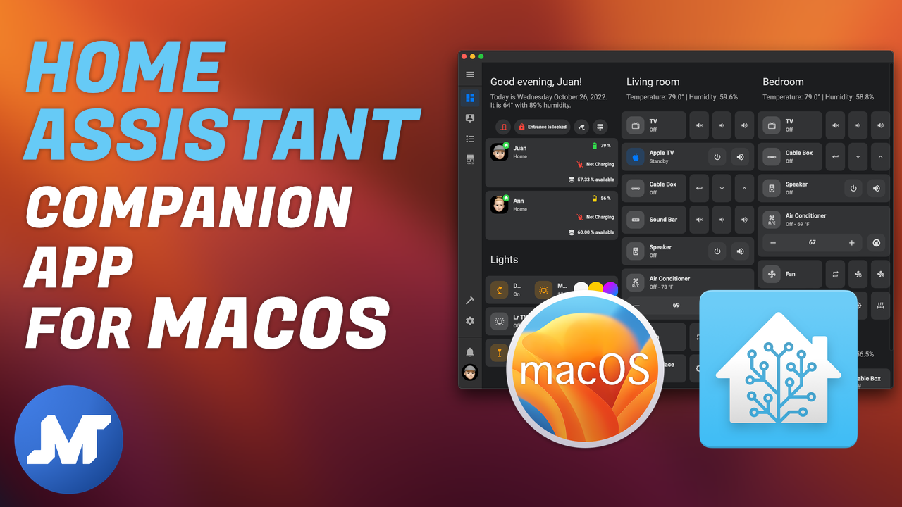
Getting started with the Home Assistant app for macOS
In this guide, we will install and configure the Home Assistant companion app for macOS.
Lovelace is a new great addition to Home Assistant. Allowing to customize the look and usability of the user interface. In this article, I’m going to show you how to set up and configure Lovelace on Home Assistant. Also, I’m going to cover some of the different card styles that we can use to customize the web interface.
The first thing that you need to do is create an empty file called ui-lovelace.yaml in the Home Assistant Config folder. Then restart Home Assistant to apply the changes. After Home Assistant is back online, you can access the Lovelace file to start customizing the web interface with the new card styles.
To be able to display cards in the user interface, you need to set them up in Views which are tabs in Home Assistant. For each View, you can set up a title or an icon to represent that tab. If you only set up 1 view, the title or the icon won’t be visible unless you add 2 or more Views.
views:
  - title: main
    icon: mdi:home-outline
    cards:
Below the View title, enter the word cards so you can then enter the different types of cards that you would like to display in this View. Save the changes to the file and then access the Lovelace interface by adding the word lovelace at the end of your Home Assistant URL https://yourdomain.duckdns.org/lovelace.
One of the great things about Lovelace is that you don’t have to restart Home Assistant or reload the page every time you make changes to the UI. You just need to save the changes on the Lovelace file and then click on the Refresh option at the top right corner of Home Assistant.
The Glance card is a very useful card that allows adding multiple entities one next to the other minimizing the overall size of the card. You can also set up entities as a toggle allowing to just click on the entity icon to trigger an action. This type of card is perfect for entities like for example, switches and lights. Let me show you an example.
All right so here I have a Glance card that I set up with 3 entities to turn on 3 different lights. When you set a card, you need to define the type of card that you want to use. In this case, a Glance card. Then you can add a title for the card and the entities that you would like to display within the card. You also have the options to not display the name or the state for the entities by adding the variables show_name or show_state and setting the value to false.
- type: glance
  title: Lights
  show_name: false
  show_state: false
  entities:
    - light.desk_light
    - switch.living_room_light
    - switch.bedroom_light
Another available option is to set up the number of columns per row using the variable columns. By default, the number of columns is set automatically depending on the number of entities. However, you can change the total amount by using this variable. So, let’s say that for the above example with the 3 entities we wanted to set up a total of 5 columns instead of just 3, we could set it like this: columns: 5
- type: glance
  title: Lights
  show_state: false
  # Add columns if you want a different number of columns per row
  columns: 5
  entities:
    - light.desk_light
    - switch.living_room_light
    - switch.bedroom_light
Now, this is pretty much the basic way to set up a Glance card. When you click on an entity, it would provide you with more info and also a toggle to turn it on or off. Now we can define the entities as objects and add more customization to be able to change, for example, the name, icon and also the tap action. To define an entity as an object, set the entity as entity: light.desk_light Then below it, you can add the variables, name, icon or tap_action. Save the file and refresh Home Assistant to see the changes.
- type: glance
  title: Lights
  show_state: false
  entities:
    - entity: light.desk_light
      name: Desk
      icon: mdi:desk-lamp
      tap_action:
        action: toggle
    - entity: switch.living_room_light
      name: Living room
      tap_action:
        action: toggle
    - entity: switch.bedroom_light
      name: bedroom
      tap_action:
        action: toggle
Next, we’re going to look at the Picture card, the Picture Entity card, and the Picture Glance card. These cards, allow us to:
Before you set up any of the picture card styles, you would need to first create a new folder labeled www inside of the config folder which would be utilized to save the images. After you create that folder, you would need to restart Home Assistant, so it knows the path for the new directory. After that, anytime you add new images to this folder, you won’t need to restart Home Assistant.
All right, here I have a Picture card that I set up to turn on my desk light. I added an image that I saved to my www folder using the path /local/ and then the name of the picture including the file extension. Then, I set up the service light.toggle to turn the light on and off, and for the service_data I added the entity ID for my desk light. Now, any time I click on the image, it would toggle the light on and off.
- type: picture
  image: /local/desk_light.jpg
  service: light.toggle
  service_data:
    entity_id: light.desk_light
Now, what if we want to have 2 of the same images, one in color to represent the light when it’s on and the other one in black and white when the light is off? Well, we can use the Picture Entity Card to define what image is display depending on the state of the light. Here is how to do it.
- type: picture-entity
  entity: light.desk_light
  tap_action:
    action: toggle
  state_image:
    "on": /local/desk_light.jpg
    "off": /local/desk_light_bw.jpg
I defined the card type as a picture-entity, for the entity, I added the desk light, then, I set up the tap_action and I set the action to toggle so instead of getting the more info pop up when clicking on the image, it would just toggle the light on and off. Lastly, I defined the 2 images for the on and off state using the state_image variable. Now, when you click on the image, it would toggle the light on and off, and the image would change to represent the specific state.
The Picture Glance card is excellent when you want to associate multiple entities to an image. On the example above, that I set up for my living room, I added 4 entities. 1 switch, which is actually connected to a floor lamp, an actual light that is on my desk, and 2 scripts to turn on my TV and soundbar. Lastly, I added the image that I want to display on the card. Now the switch and the light would work as a toggle, and the 2 scripts would show the more-info-dialog pop-up which would allow us to execute the scripts.
type: picture-glance
  entities:
    - switch.living_room_light
    - light.desk_light
    - script.tv_power_toogle
    - script.soundbar_power_toogle
  image: /local/living_room.jpg
Now, like on the Picture Entity Card, we can set up 2 images to represent the on and off state of the light in the room. To do that, replace the image variable with the state_image and define the 2 images for the on and off state. Then, below enter the entity light that would change the image. Now anytime you toggle the living room light, the image would also change depending on the state.
- type: picture-glance
  entities:
    - switch.living_room_light
    - light.desk_light
    - script.tv_power_toogle
    - script.soundbar_power_toogle
  state_image:
    "on": /local/living_room.jpg
    "off": /local/living_room_bw.jpg
  entity: switch.living_room_light
There is another picture card that I’m not covering on this tutorial, and it’s the Picture Elements card. This type of card allows to set up an image of a floor plan and add icons, text, and services in different parts of the image. I would like to cover this card in more detail on a separate tutorial so if you guys are interested, let me know via social media or in the comments for the video above.
The Conditional card allows to only show a card depending on the state of an entity. For example, if we set up a Chromecast using the Media Control card, we can define using the Conditional card to only display the card when something is playing on the Chromecast and not when the device is off or unavailable.
Here I have this Conditional card that I set up, and under the conditions, I enter my living room Chromecast twice. One with the state_not set to off and the other one set to unavailable. Then, below I set up the card with the media-control card and the entity for the living room Chromecast. So, now if the Chromecast is not off or unavailable, then the media control card for the living room Chromecast would display.
- type: conditional
  conditions:
    - entity: media_player.living_room_tv
      state_not: "off"
    - entity: media_player.living_room_tv
      state_not: "unavailable"
  card:
    type: media-control
    entity: media_player.living_room_tv
This little set up here is perfect if you have multiple Chromecast devices, Google Homes and other devices that you would only like to display in a specific state.
Now, what if we want to use the traditional card style where you have entities grouped in a list? Well, we still can do so and with a little more customization using the Entities card.
On this example that I set up for my office area, I added a light entity for my desk light, a switch to turn my computer on and off and a script to lock my computer. As we have done on other cards, we can also define the entities in here as objects and be able to change the name and the icon.
- type: entities
  title: Office
  show_header_toggle: false
  entities:
    - entity: light.desk_light
      icon: mdi:desk-lamp
    - switch.computer
    - script.pc_lock
For entities like scripts, where you get the EXECUTE button, we can now change the button label to something else by using the call-service element.
For example, the script to lock my computer, we would define the type as a call-service. Add a name and an icon for the entity. Then to customize the button label, we would add the variable action_name and set the value to whatever we would like the label to be. Then we need to add the service and the service_data that we want to trigger. In this case is a script so we would add the same entity Id for the service and the service data. Lastly, save the file and refresh Lovelace and the script would now look like this.
- type: entities
  title: Office
  show_header_toggle: false
  entities:
    - entity: light.desk_light
      icon: mdi:desk-lamp
    - switch.computer
    - type: call-service
      name: PC
      icon: mdi:lock
      action_name: Lock
      service: script.pc_lock
      service_data:
        entity_id: script.pc_lock
Other elements that we can use with the Entities card are dividers and also weblinks. To add a divider, you can simply add - type: divider
Now, by default, the divider is set to 1px, and it uses the secondary text color in the current theme. You can customize this by using the style variable and changing the height and the background-color values.
- type: divider
  style:
    height: 2px
    background-color: “#B3B3B3”
To add a Weblink, you can enter the following and customize the name and the icon for the specific URL.
- type: weblink
  name: JuanMTech
  icon: mdi:link
  url: https://www.juanmtech.com
- type: weblink
  name: Home Assistant page
  icon: mdi:home-assistant
  url: https://www.home-assistant.io/
Similar to the way we used the Conditional card earlier, we can set up entities that would only show on a specific state. This card style is perfect for when you want to track lights that were left on or to show a list of people only when they are home.
So here I added my lights to an Entity Filter card and I set it as the first card on my main View so like that the first thing that I see when I open Home Assistant, is the lights that are currently on. Like other cards, we can define the entities as objects and customize the name, icon and the tap action. Then below, I added the state_filter, and I set it to on so the entities only show when they are on. I also added the show_empty variable set to false so like that the card only shows when the lights are on. Now, by default, this card uses the Entities card style, but I changed it to use the Glance card instead, by defining the card type below, and I also added a title.
- type: entity-filter
  entities:
    - entity: light.desk_light
      name: Desk
      icon: mdi:desk-lamp
      tap_action:
        action: toggle
    - entity: switch.living_room_light
      name: Living room
      tap_action:
        action: toggle
    - entity: switch.bedroom_light
      name: Bedroom
      tap_action:
        action: toggle
    state_filter:
      - "on"
    show_empty: false
    card:
      type: glance
      title: Lights currently on
Now, any time my lights are turned on, a new card would pop up at the top of Home Assistant showing the current lights that are on.
These cards, allow us to group multiple cards vertically or horizontally so like that the cards always stay together in the same column or next to each other within the space of a column.
In this example, I set up a Vertical Stack that contains 1 Markdown card, which allows us to add custom text so we can use it as a title. Then I set up a Horizontal Stack with 4 Glance cards with 1 entity each. And then, I set up another Horizontal Stack for the second row that contains another 4 Glance cards. Now, each Glance card is set up to not show the name or the state and also to act as a toggle so you can quickly just click on the icon to trigger the entity.
- type: vertical-stack
  cards:
    - type: markdown
      content: >
        ## Living room TV
      - type: horizontal-stack
        cards:
          - type: glance
            show_name: false
            show_state: false
            entities:
              - entity: script.tv_power_toogle
                tap_action:
                  action: toggle
          - type: glance
            show_name: false
            show_state: false
            entities:
              - entity: script.cable_power_toogle
                tap_action:
                  action: toggle
          - type: glance
            show_name: false
            show_state: false
            entities:
              - entity: script.soundbar_power_toogle
                tap_action:
                  action: toggle
          - type: glance
            show_name: false
            show_state: false
            entities:
              - entity: script.lr_tv_volume_up
                tap_action:
                  action: toggle
      - type: horizontal-stack
        cards:
          - type: glance
            show_name: false
            show_state: false
            entities:
              - entity: script.cable_input
                tap_action:
                  action: toggle
          - type: glance
            show_name: false
            show_state: false
            entities:
              - entity: script.chromecast_input
                tap_action:
                  action: toggle
          - type: glance
            show_name: false
            show_state: false
            entities:
              - entity: script.switch_input
                tap_action:
                  action: toggle
          - type: glance
            show_name: false
            show_state: false
            entities:
              - entity: script.lr_tv_volume_down
                tap_action:
                  action: toggle
The last thing that I want to show you today is how to make the Lovelace UI be the default interface when you open Home Assistant. To do that click on info under the Developer tools, then click on Set Lovelace as the default page on this device. Now, anytime you open your home Assistant without adding the word lovalace at the end of the URL, it would automatically redirect you to the Lovelace page.
Another thing that you need to have in mind is that you would need to do this steps on all the devices that you access Home Assistant.
All right, guys, so there is a lot more to cover for the new Lovelace UI like for example custom cards that the Home Assistant community has made available. So if you guys would like to see a part 2 for this tutorial, definitely let me know via social media or in the comments on the above video and also let me know what custom cards you would like me to cover.
I have my Home Assistant configuration on GitHub, so if you would like to check it out and get some ideas for your setup, you can check it out here.
One-time Donation
Buy Me a CoffeeSubscription
Become a PatreonIn this guide, we will install and configure the Home Assistant companion app for macOS.
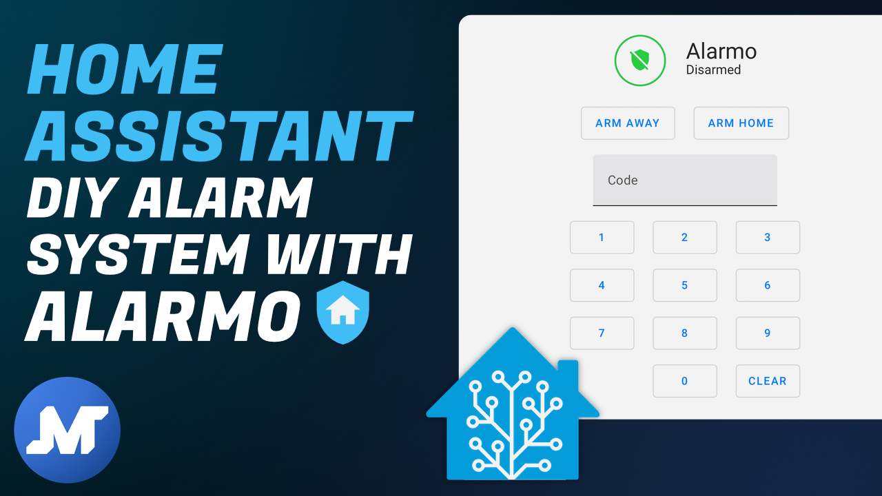
In this guide, we'll go over how to install and configure Alarmo with Home Assistant
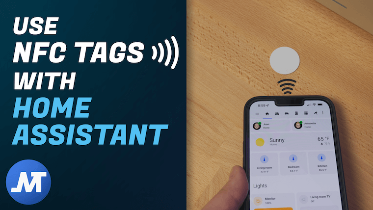
This article will show you how to integrate NFC Tags with Home Assistant. I will also show you how you can use them with your automations